Product list widget
Product List Widget
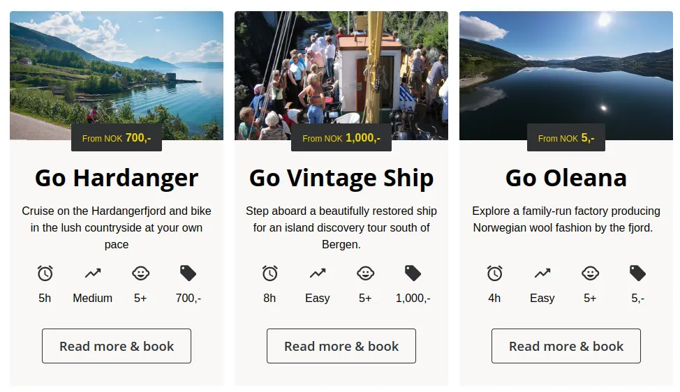
The Product List Widget displays a list of product cards, each featuring a picture, text, icons, and a “Read More” button. This widget supports Bilberry’s product collection feature or directly specified product catalog IDs, offering flexibility in setup.
Key Features
-
Dynamic Product Display Showcases product cards with rich visuals and detailed information.
-
Customizable Layout Configure scrolling or wrapping, number of cards per row, and alternating colors for a tailored look.
-
Custom URLs Link each product card to specific “Product Detail” pages with customizable URLs.
How to Use
Add the widget to your webpage using the HTML snippet below. Customize its properties as needed.
Examples:
- Using Product Collection ID:
<bilberry-product-list product-collection-id="123"></bilberry-product-list>- Using Product Catalog IDs:
<bilberry-product-list product-catalog-ids="1,2,3" scroll="no" product-catalog-urls="/page-1,/page-2,/page-3"></bilberry-product-list>- Advanced Configuration:
<bilberry-product-list product-catalog-ids="1,2,3,4" scroll="no" background-colors="#395542,#1D252D,#333F48" text-colors="#FFFFFF,#FFFFFF,#FFFFFF" primary-colors="#183028,#333F48,#1D252D" primary-text-colors="#FFFFFF,#FFFFFF,#FFFFFF" accent-colors="#183028,#333F48,#1D252D" accent-text-colors="#FFFFFF,#FFFFFF,#FFFFFF"></bilberry-product-list>Widget Properties
| Property | Description | Default Value | Required |
|---|---|---|---|
product-catalog-ids | Comma-separated list of product catalog IDs. Either this or product-collection-id is required. | N/A | Yes* |
product-catalog-urls | Comma-separated list of URLs for “Product Detail” pages. Order must match product-catalog-ids. | Unset | No |
product-collection-id | ID of a product collection defined in Bilberry Backoffice. Either this or product-catalog-ids is required. | N/A | Yes* |
scroll | Determines if cards scroll (yes) or wrap (no). | no | No |
orientation | Orientation of the product cards: portrait or landscape. Landscape stacks cards. | portrait | No |
num-xs | Number of cards visible per row on extra small screens (mobile). | 1 | No |
num-sm | Number of cards visible per row on small screens (tablets). | 2 | No |
num-md | Number of cards visible per row on medium screens (small desktop screens). | 2 | No |
num-lg | Number of cards visible per row on large screens (large desktop screens). | 3 | No |
background-colors | Comma-separated list of HTML color codes for card backgrounds. | Unset | No |
text-colors | Comma-separated list of HTML color codes for card text. | Unset | No |
primary-colors | Comma-separated list of HTML color codes for primary card elements. | Unset | No |
primary-text-colors | Comma-separated list of HTML color codes for primary text on cards. | Unset | No |
accent-colors | Comma-separated list of HTML color codes for accent card elements. | Unset | No |
accent-text-colors | Comma-separated list of HTML color codes for accent text on cards. | Unset | No |
lazy-load | Set to yes to defer loading the widget content until it is visible in the viewport. Options: yes, no. | no | No |
Text Customization Properties
| Property | Description | Default Value | Required |
|---|---|---|---|
button-text-customization-keys | Comma-separated list of text customization keys for the “Read More” button. Order must match product-catalog-ids. | Unset | No |
Setting Up on Wix
If you’re using Wix as your website builder, follow these steps to configure the widget:
- Access the Configuration Guide: Refer to the relevant guide in these docs for general widget setup on Wix.
- Use the Following Values:
- Server URL:
https://bilberry-widgets.b-cdn.net/v4/wix-wrappers/WixBilberryProductList.js - Tag Name:
wix-bilberry-product-list
- Server URL:
Tips for Effective Integration
- Highlight Key Products: Use the
product-catalog-idsandproduct-catalog-urlsproperties to feature specific products with links to dedicated detail pages. - Optimize Layout for Devices: Configure the
num-*properties to control how many cards are displayed per row on different screen sizes. - Customize Visuals: Define alternating colors for cards using the color-related properties to enhance visual appeal.
- Test Scroll and Wrap Options: Experiment with the
scrollsetting to find the best layout for your website. - Experiment with the Orientation: Use the
orientationproperty to stack cards in landscape mode for a different look.
By integrating the Product List Widget, you can provide users with an engaging and interactive way to explore your products, encouraging interest and engagement.